The new version Bulma 0.8.0 is out! 😃 It comes with several bug fixes and a lot of nice new features:
- Light/Dark colors
- Better visual look
- Panel colors
- Larger form controls
- 4-value color map
- Scheme variables for “Dark mode”
More in the Changelog.
Light/Dark colors #
Each main color ("primary", "info", "success", "warning", "danger") now comes with a *-light and a *-dark version. They are calculated using 2 new color functions:
findLightColor()which finds the light version of a colorfindDarkColor()which finds the dark version of a color
The light colors are used by the button element:

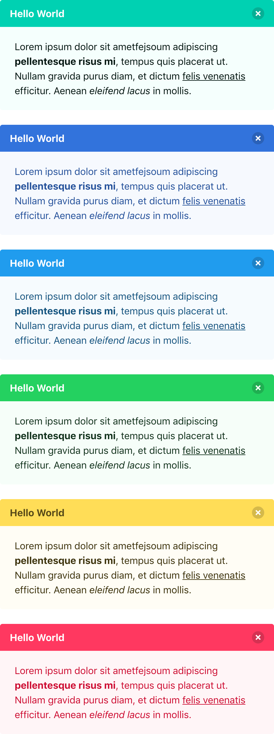
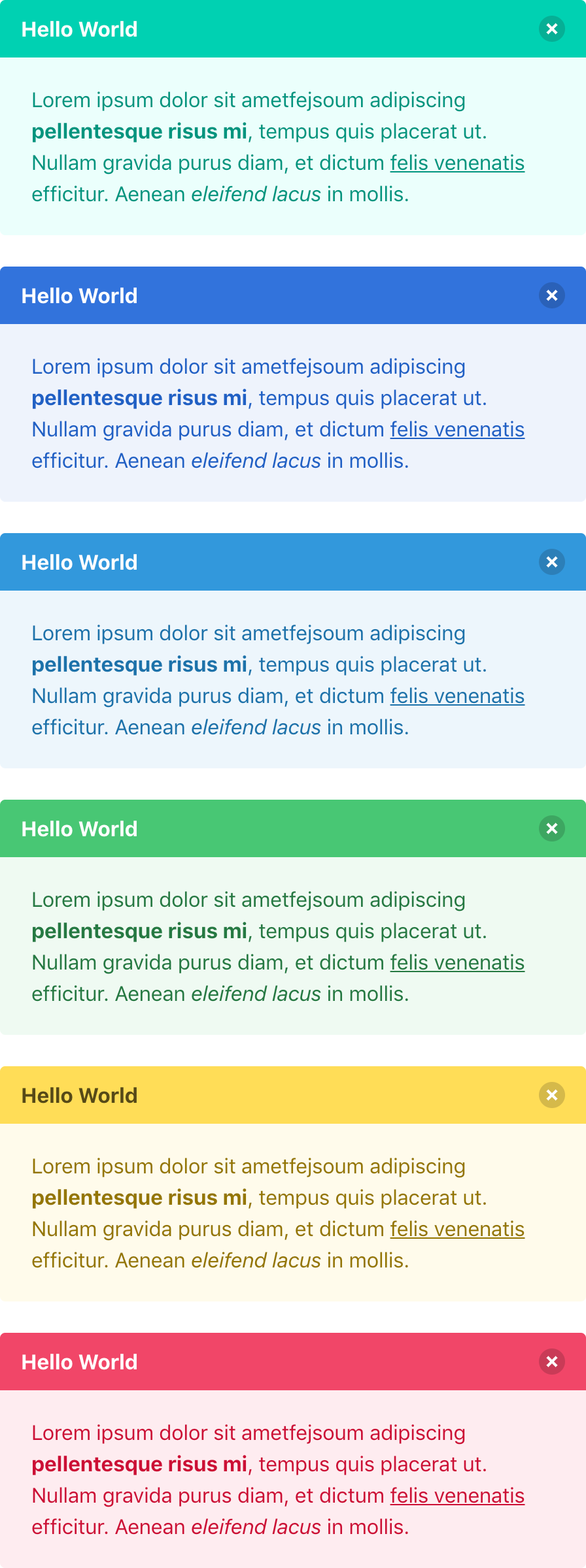
The light and dark colors are used by the message component, which generates much prettier colored versions. See the difference between before (left) and after (right):
Better visual look #
Some of the Bulma colors have been updated:
| Color | Before | After |
|---|---|---|
$green
|
hsl(141, 71%, 48%)
|
hsl(141, 53%, 53%)
|
$cyan
|
hsl(204, 86%, 53%)
|
hsl(204, 71%, 53%)
|
$red
|
hsl(348, 100%, 61%)
|
hsl(348, 86%, 61%)
|
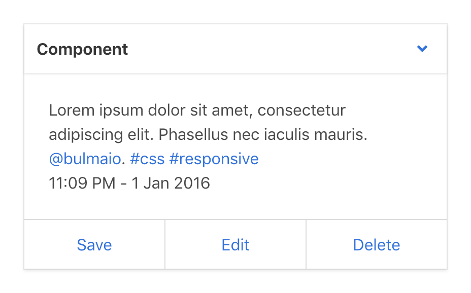
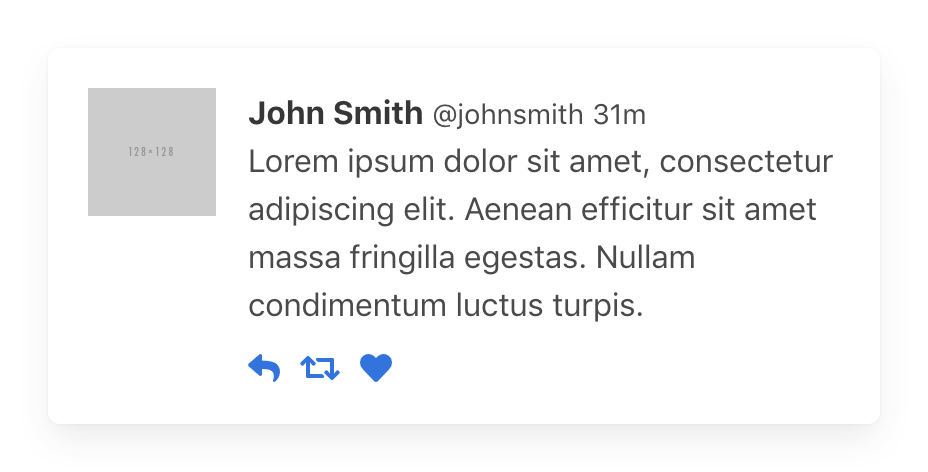
The shadows of the box and card have been improved:
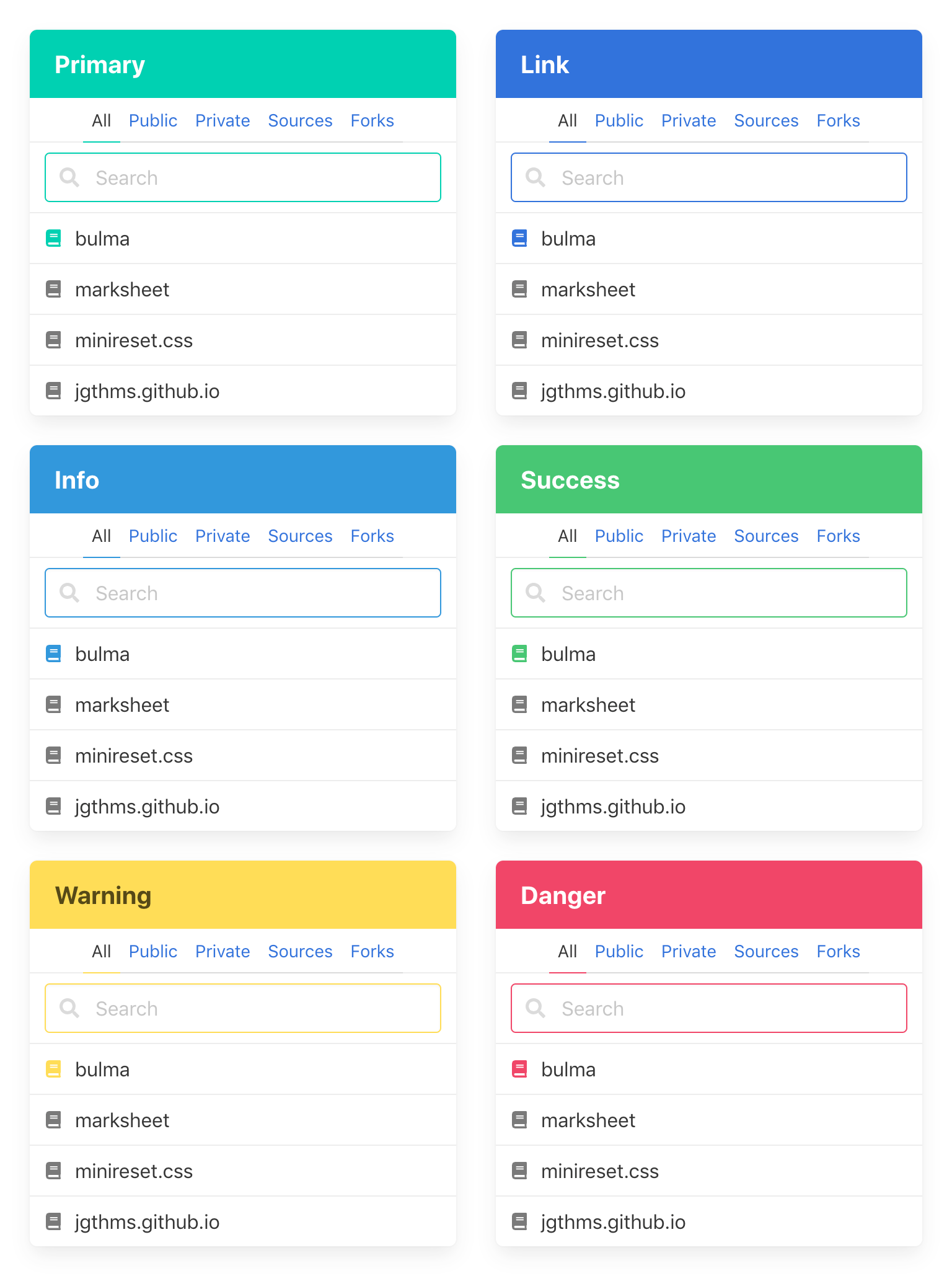
Panel colors #
The panel component is now available in all colors:
Larger form controls #
Form controls and buttons are now 2.5em high. You can revert this resizing by setting these previous values:
$control-height: 2.25em
$control-padding-vertical: calc(0.375em - #{$control-border-width})
$control-padding-horizontal: calc(0.625em - #{$control-border-width})

$button-padding-vertical: calc(0.375em - #{$button-border-width})
$button-padding-horizontal: 0.75em
4-value color map #
The $colors Sass map now accepts, for each of its values, a map of up to 4 values. For example: the key "info" now has the ($info, $info-invert, $info-light, $info-dark) map.
If you provide a $custom-colors map, you can decide to provide a map of 1, 2, 3 or 4 values for each value. If fewer than 4 are provided, Bulma will calculate the remaining ones:
$custom-colors: (
  "lime": (lime),
  "tomato": (tomato, white),
  "orange": ($orange, $orange-invert, $orange-light),
  "lavender": ($lavender, $lavender-invert, $lavender-light, $lavender-dark)
);
This is processed by the updated mergeColorMaps() Sass function.
Scheme variables for "Dark mode" #
There are 6 new $scheme derived variables: $scheme-main $scheme-main-bis $scheme-main-ter $scheme-invert $scheme-invert-bis $scheme-invert-ter
They replace the $white and $black occurrences in the codebase.
This makes it easy to create a “Dark mode” simply by swapping the values:
$scheme-main: $black
$scheme-invert: $white
// etc.
That is also why most of the codebase now references derived variables ($text, $background, $border etc.) instead of initial ones ($grey, $grey-lighter, $grey-darker etc.): updating the derived variables will affect all elements and components directly.
The new 0.8.0 version should be fully compatible with any Bulma setup. Feel free to post an issue if you encounter any problem upgrading.

